Core Web Vitals – Improve Cumulative Layout Shift (CLS)
Have you ever tried clicking on a button and ended up opening something else, like an annoying ad, because the page contents were suddenly pushed down? Or maybe what you’re reading moves down when a new ad appears?
These are examples of unexpected layout shifts that occur without you interacting with the page. The event can occur for any number of reasons — regardless, this isn’t an enjoyable experience for visitors. Cumulative Layout Shift is a way of quantifying the impact in an objective manner .
How is Cumulative Layout Shift Score Calculated?
It’s not just what’s above the fold on the initial load that counts. All visible layout shifts — these can occur while scrolling — are considered when determining the score.
There are two factors that come into play when determining CLS score:
- Impact fraction: the amount of screen affected by the shift
- Distance fraction: the distance moved as a percentage of the screen
CLS score = impact fraction * distance fraction
So if a large part of the screen (e.g. 80% or 0.8) moves down substantially on the screen (e.g. 40% or 0.4) the layout shift score is 0.32. In calculating the final score, they don’t just add up all the layout shifts. They don’t calculate an average, as that could favor pages that are open for a relatively short time. Instead, they determine CLS in each session window and take the maximum.
What’s a Good CLS Score?
It’s called Cumulative Layout Shift because the score is based on the accumulation of individual layout shifts. Originally, CLS was just the sum of all layout shifts. Now it uses the “maximum session window with 1 second gap, capped at 5 seconds” to “make the CLS metric “more fair to pages that are open for a long time.”
Still, while an individual layout shift may not have much of an impact, when added together, it may be a different story.
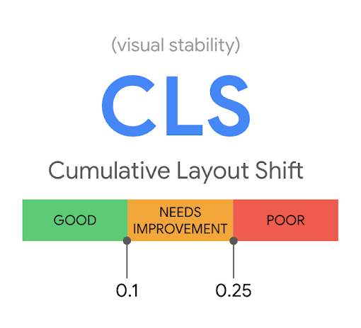
A ‘good’ CLS score is anything under 0.1. Anything above 0.25 is considered ‘poor’. Between 0.1 and 0.25 ‘needs improvement.’
You can measure CLS using lab data available through tools like Lighthouse, Webpagetest, or Chrome DevTools. As the name implies, lab data simulates a user’s experience. You’ll want to compare lab data from the changes you make against real user data. In doing so, one thing to remember is that layout shifts are only considered during page load. That’s different from field data, where all layout shifts are considered, from entry until the page is closed.
Real user data comes from real user interactions gathered by Google and third-parties over a period of time and under a variety of conditions. The Chrome User Experience Report (CrUX) is the main source of real user data (field data) for Google. PageSpeed Insights and the Core Web Vitals report in Google Search Console use this data.
CLS is most challenging on mobile due to many factors including:
- Smaller screen or viewport
- Mobile network issues
- Weaker Central Processing Unit (CPU)
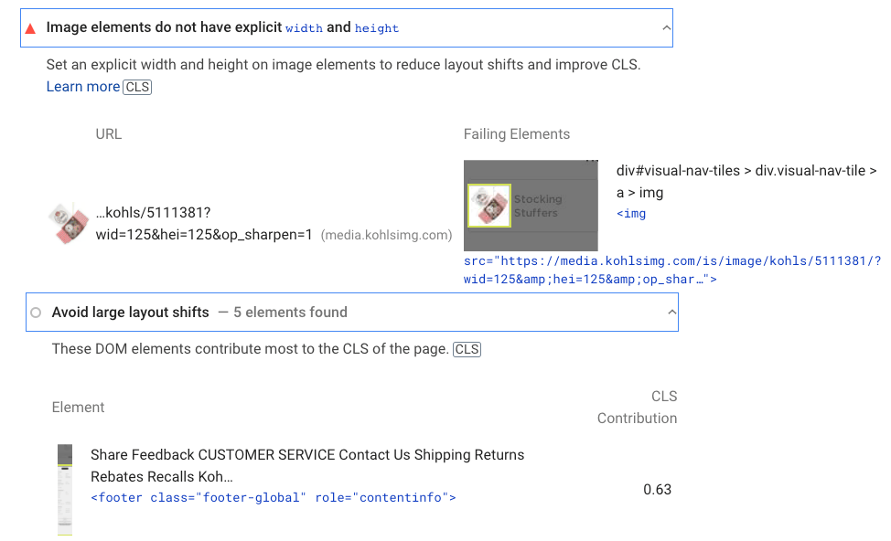
Here’s an example of a page with a poor CLS score of 1.065 based on lab data. PageSpeed Insights shows the relevant audits.
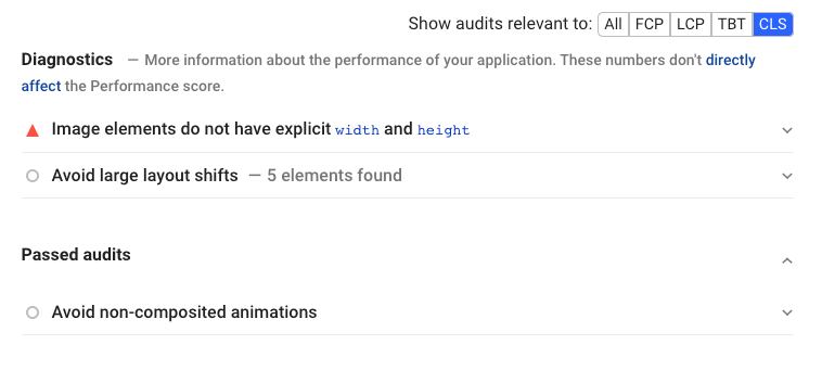
Clicking on an audit reveals the details.
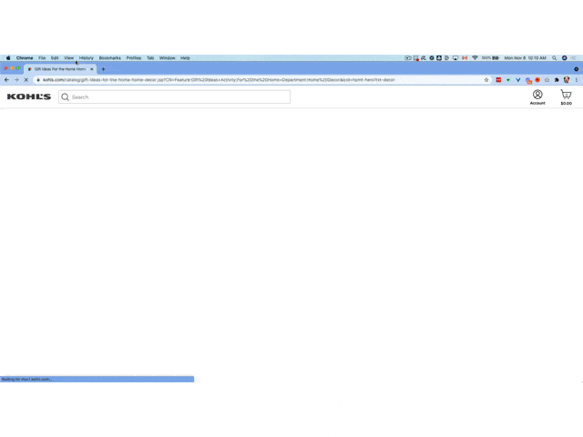
Here’s a video showing how the page loads the content first and then the advertisement, which causes the shift in content.
Factors That Can Affect This Core Web Vital
The most common causes of a poor CLS score are:
- Images without dimensions
- Ads, embeds, and iframes without dimensions
- Dynamically injected content
- Web Fonts causing FOIT/FOUT (Flash of Invisible Text and Flash of Unstyled Text)
- Actions waiting for a network response before updating the DOM (Document Object Model) – often caused by ads.
How to Fix a Poor CLS Score
Let’s look at how to address these cumulative layout shift issues to get your CLS score out of the ‘poor’ house.
Set dimension attributes for image and video elements
Width and height size attributes enable browsers to properly allocate the necessary space so that there’s no shift when loading images or video. If you’re using WordPress, this shouldn’t be an issue because image dimensions are added by default.
If that’s not the case, many WordPress page speed optimization plugins can automatically include any missing dimensions.
Another way to do this is through CSS. As this Google document explains, “Modern browsers now set the default aspect ratio of images based on an image’s width and height attributes so it’s valuable to set them to prevent layout shifts.”
For example, with both dimensions specified, you can set the width and the browser will automatically set the correct height — since it knows the correct aspect ratio. Because the browser calculates the image aspect ratio before loading, no layout shift occurs.
For responsive images, the srcset attribute allows the browser to display the best size for the environment, based on the several that you’ve uploaded.
Manage space for ads, embeds, and iframes
Here are some best practices to reduce a large layout shift:
- Assign dimensions to each ad, reserving enough space.
- Allocate space for off-screen ads so that they don’t cause a layout shift.
- Use a placeholder element when no ad is returned. Don’t collapse the reserved space.
- Place non-sticky ads away from the top of the viewport
- Precompute enough space for embeds and iframes and have a placeholder or fallback element.
Manage dynamic content
The best way to deal with dynamic content is by not inserting it above existing content, unless it’s a response to user interaction. Remember that CLS only looks at layout shifts that occur without user interaction. If you’re using a WordPress page optimize plugin, check to see if you can delay JavaScript execution until there’s interaction, thereby avoiding an unexpected layout shift.
Some WordPress plugins, like related posts, may insert dynamic content.

If the plugin is being maintained, the developer should have provisions somewhere in their settings to address the issue.
Preload fonts
Preloading fonts is the best way of dealing with FOUT (when the fallback font is exchanged with a new font) and FOIT (when invisible text is displayed until the new font renders). It tells the browser to prioritize loading this resource so that it gets included when the page’s primary content is loaded.
Here’s an example from our blog where the fonts are preloaded in the WOFF2 format, the smallest file size currently available.

The developer of our blog theme coded this. But WordPress page optimization plugins include the ability to preload fonts. Check out this option if you lack access to development resources.
Preloading fonts also helps if you get the “Ensure text remains visible during Webfont load” recommendation from PageSpeed Insight.
Takeaway
Unexpected layout shifts are annoying; there’s no denying it creates a bad page experience. Fortunately, CLS gives us an objective way of evaluating the extent of the issue. While every site is unique, there are some common elements that contribute to a low CLS score. Some of these you may be able to address yourself, while others may require advanced technical skill.
Stephen leads the content strategy blog for MarketMuse, an AI-powered Content Intelligence and Strategy Platform. You can connect with him on social or his personal blog.