eCommerce Content Maturity Model
The eCommerce Content Maturity Model is a way for eCommerce providers to improve the quality and value of their content. It’s a conceptual framework that eCommerce sites will go through at one time or another.
It starts with a simple category page and over a number of steps, evolves into a rich experience that fully reflects the buyer journey.
Let’s look at these phases in more detail.
Stage 1 — Creating a Category Page.
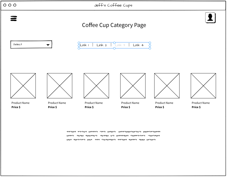
Let’s say I have an e-commerce site with things I sell. We’ll call them Coffee Cups Today. So I’ve got lots of coffee cups — I’ve got green ones, and I’ve got blue ones.
And I create a category page for those coffee cups. That’s a slicer for those two colors. Slicer is a data analytics term, by the way, for how you can slice or filter data very quickly — like in a pivot table or something.
But that’s all I got.

Did I mention that’s susceptible to a lot of problems, right? The page doesn’t have any unique value. You may get some presence with coffee-cup-specific terms if you have enough off page factors, or brand authority.
But it’s highly likely that you won’t.
For example, if you’re Home Depot, your slicer page (your permutation page) might be coffee cups that are green. Now, for some longtail search terms, it should be able to perform.
But if you’re Jeff’s hardware store, no, not so much luck.
Stage 2 — Adding a Category Blurb
So what is a eCommerce provider to do?
The first thing they’d learned long ago was to put blurbs in category blurbs. What’s a category blurb?
The first level of maturity for a category blurb is describing the thing that’s being shown. Coffee cups are great. You can drink out of them. You can put dark coffee, light coffee, medium coffee in them. Sometimes they break. Sometimes they have big circles on the top openings. Sometimes they have small ones. Some of them are thermal compact. Some of them aren’t right.

We’ve all written those crappy category blurbs before.
Stage 3 — Linking
Now what happens? You start thinking, “Oh, this isn’t that great of a piece of content. Maybe let’s put that blurb at the bottom of the page.”
No one sees it there, but it’s good for SEO, so let’s do it. But you also might think of linking to other pages that reference it.
So I might go, “Hey, I have coffee cups that are blue, green, red, orange, and yellow rainbow.” And then I link blue, green, yellow, orange rainbow to my yellow slicer pages.

But a slicer or a permutation category page that doesn’t have a unique value is susceptible to what’s called shingling.
Stage 4 — Shingling
We’re not talking about the disease, known as shingles. Shingling is when you have two pages that are very equivalent, but they’re shuffled into the same clumps of content. I like to think it was named shingles because, if you think of a roof, it has shingles. You can shuffle up the shingles any way you want, but they provide the same net value.
I’ll give you an example. Let’s say I created a “cool coffee cup” page, and then I just had “fun coffee cups”. They have the same coffee cups on it. I just shuffled them up.
Okay. In 2004 you could so this for SEO, but not anymore. But then Google caught on to shingling by eCommerce providers, and they put a stop to it.

And so, this is a long way of saying the ecommerce content maturity model was to then put a unique blurb of content on each of the shingles. See where I’m going with that?
So now blue coffee cups are great because they remind me of the sky and the sea and the ocean. People that like blue coffee cups often have big, great days and great mornings.
Okay.
So I’m writing stuff like that to differentiate the blue coffee cup page, okay?
Stage 5 — Adding Siloed Content
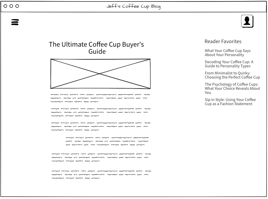
Gotta get better than that. So category pages then took another journey. People started writing blogs and content at eCommerce companies.
They were still siloed. Why were they siloed?
Because people are afraid of putting content on those category pages, even if that is part of the buyer journey. So they’d have the blog over here and then they’d have the category pages over there.
And the category pages had SEO blurbs or category blurbs. That’s another level of maturity.
It’s good because you’re driving traffic for the actual buyer journey. But the catch is, they weren’t talking to one another because people were afraid.
“I don’t wanna put this big chunk of text above the category page. It might make people not buy.”
I’ve been through this journey with so many people. This is the stage that we’re in right now where the left hand isn’t talking to the right hand inside the organization. And by the way, the largest eCommerce companies in the world are at this stage — many of them because they have different goals with content. So the CRO (conversion rate optimization) professionals, the monetization professionals are like “No, don’t mess up my page. This category page makes all the money, don’t touch it.”
So the missed opportunity is that you’re not showing the prospect a showcase of all the content that we have on this topic and giving them access to it. It’s the showcase that a business knows what they’re talking about.
- They understand the buyer journey.
- They understand the customer.
- They understand that journey.
What happens when an e-commerce provider doesn’t provide a showcase of their understanding of the buyer journey?


The only people buying are the ones at the far end of the funnel. So the thing that the CRO or the monetization specialist is afraid of is disruption of the late stage buyer, because the middle stage buyer doesn’t buy by just looking at a category page, the early stage buyer certainly doesn’t buy either.
For example, I’m going to go buy a car via an eCommerce site, a very large purchase. The only person that’s going to buy the car is super late in the funnel. They’re gonna have research experiences somewhere else, if I don’t provide them. They may wayfind to the rest of the stuff that I’ve done on my site, but they likely won’t.
Here’s what happens when I have the fundamental thought that eCommerce pages on my site are a trap door. They’re blocked off and don’t show access to the blog. It might distract them. Don’t show the content; put the category stuff below. So what I’m doing is I’m cutting off the ability for someone to be part of a buyer’s journey with me.
Stage 6 Content Connects the Buyer Journey
So now the next phase is realizing that my category pages are an opportunity to showcase that I know ’em and that I have expertise. But how do I do that creatively, such that it doesn’t distract late stage buyers?
There are a couple ways to do that. One is with personalization, where I’m looking at their behavior on the site to try to discern whether they are super late-stage, whether they are likely or not to consume my buyer-journey content. And that’s one path.
The other one is to treat that page like a showcase with way-finding opportunities, where they can select to enter buyer journey and influence content. I may also show that content on other pages. It’s easy to assume that they know where to find the content they want, right?
So I worked with a music instrument store that had this issue. They were in the same stage of their eCommerce content journey.
Left hand didn’t wanna talk to the right hand with the content. They had an entire site that got millions of visits. None of that content was linked to from the category pages. The category pages had 300 word blurbs. That was what their CMS allowed. You couldn’t even get to it!

So there it sat, a community of professionals, experts, instructors that was thriving on this other hub and it was completely siloed. So we worked to bring that in, weaving those things together successfully to make a portion of their pages a showcase of their expertise.
Then, they tested through AB multivariate testing to determine whether it had an impact on sales. And it did — it dramatically improved.
So I always recommend personalization because it’s ideal. What I don’t recommend is you relegating it below the fold, because it misses the point. The point is that if someone really doesn’t know what to do and they are in the buyer’s journey, not being able to access that content hurts your ability to sell to them.
And it also exhibits that you don’t have the expertise right front and center, and that’s not the best you can do. So you gotta figure out the access points for the knowledge. I’ve seen cases where people are anchoring below the products. I’ve seen people point out with an open-in-new-window. I’ve seen a lot of experiences where you can get people to those places very elegantly.
If you can personalize, some of the things you want to look for in a test plan are:
- How many pages are in this user session right now?
- Have they looked at other category pages?
- Have they looked at other long form pages or mid form pages or prior journey pages in this session?
If they have had those experiences in this session, remove prominent access to those buyer journey links or change the way to keep them in that buyer mode. If it was five or seven years ago, as in the example I talked about, that’s what I’d have put front and center for them.
The more likely that the user is close to the purchase action, the less intrusive I want my showcase of expertise. However, the majority of your users aren’t in that purchase action state and the buyer journey content is extremely important for you to build a rapport and push them through that journey.

Takeaway
The eCommerce Content Maturity Model is a way for eCommerce providers to improve the quality and value of their content. It’s a journey that starts with creating a category page and ends with connecting that content to the category pages through links and calls-to-action. This model encourages personalization and gives buyers access to content that’ll help them in their decision-making process.
If you’d like to learn how to create better content faster.
Visit our blog.
If you know another marketer who’d enjoy reading this page, share it with them via email, LinkedIn, Twitter, or Facebook.