Optimize Gets a Makeover and More
You spoke. We listened.
Yesterday saw the release of a more refined experience when using Optimize. Based on your feedback, we made some changes to help writers improve their productivity with a more efficient workflow.
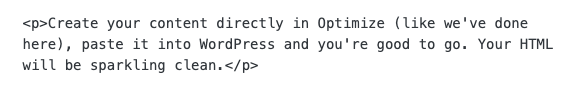
Cutting and pasting Google Docs into WordPress frequently results in all sorts of formatting issues and messy HTML. Those days are over!
Let’s take a look at some other improvements in this release.
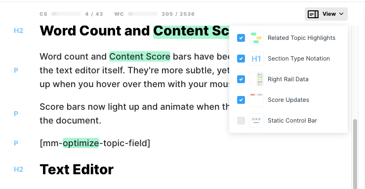
Word Count and Content Score Bars
Word count and Content Score bars have been relocated to over the text editor itself. They’re more subtle, yet easy to see and light up when you hover over them with your mouse.
Score bars now light up and animate when they detect a change in the document.
Text Editor
Size of the font, space between lines, and space around the editable area have been increased to improve legibility and the ease of highlighting, selecting, and navigating documents.
The style of the Related Topics highlight has been updated to be less visually distracting.
The text formatting options now appear over text you have selected, this can be toggled to a version that remains fixed at the top of the screen, near the Word Count and Content Score bars for a more traditional WYSIWYG experience.
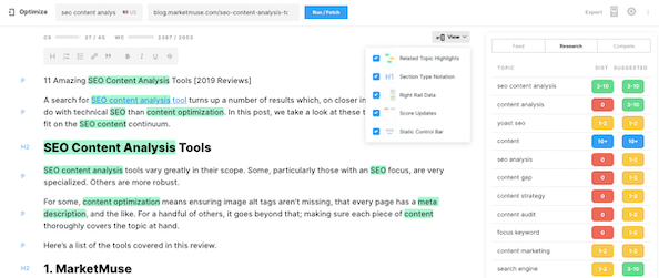
The View Switcher lets you control the appearance of the screen, toggling the following:
- Related Topic Highlights
- Section Type Notation
- Right Rail Data
- Score Updates
- Static Control Bar
Section type indicators appear to the left of the Text Editing area for quick reference when counting headlines, scoping block quotes, etc.
Right Rail
Styling of the right rail has been updated to provide a more streamlined appearance. Animations have been applied to create a more dynamic, and friendly experience when looking at Variant Topics.
Dashboard Module Descriptions
Anyone who create their own dashboard modules can now add descriptions to their modules. Instead of trying to cram everything into one long title.
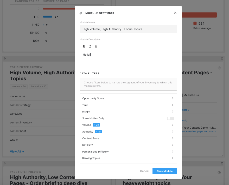
Some possible ways of using the description include:
- Adding a general description on what the module is trying to communicate.
- Adding some next steps or direction on what exactly to do with the data you get from the module.
- Using it for assignments. You can tell someone on your team to own that module workflow using the text function.
- Plugging in status updates (ie. go to Plans to find what needs to be worked on for this workflow).
As always, we welcome your feedback!
If you’d like to learn how to create better content faster.
Visit our blog.
If you know another marketer who’d enjoy reading this page, share it with them via email, LinkedIn, Twitter, or Facebook.Stephen leads the content strategy blog for MarketMuse, an AI-powered Content Intelligence and Strategy Platform. You can connect with him on social or his personal blog.